
I’ve been making work that revolves around papercuts for years, and this project developed from the one above. Interested in the idea of stacking forms and crowded compositions, the process of roughly drawing shapes then refining and changing them through use of the scalpel, I created a whole lot of A5 papercuts.


The frantic nature of the designs felt like I was channelling my feelings that these times are overwhelming and hectic. The cutting process actually feeling more meditative, and looking at the design in stages as I cut gave me ideas for potential in print layering.
Alongside enjoying this process the practicality of using paper cuts has the financial benefit, when thinking about translating them into print. They expose well on screen, so the burden of printing designs onto acetate is avoided. I exposed all the cuts on screen and printed them in a couple of different colours, allowing me to compare them all better.


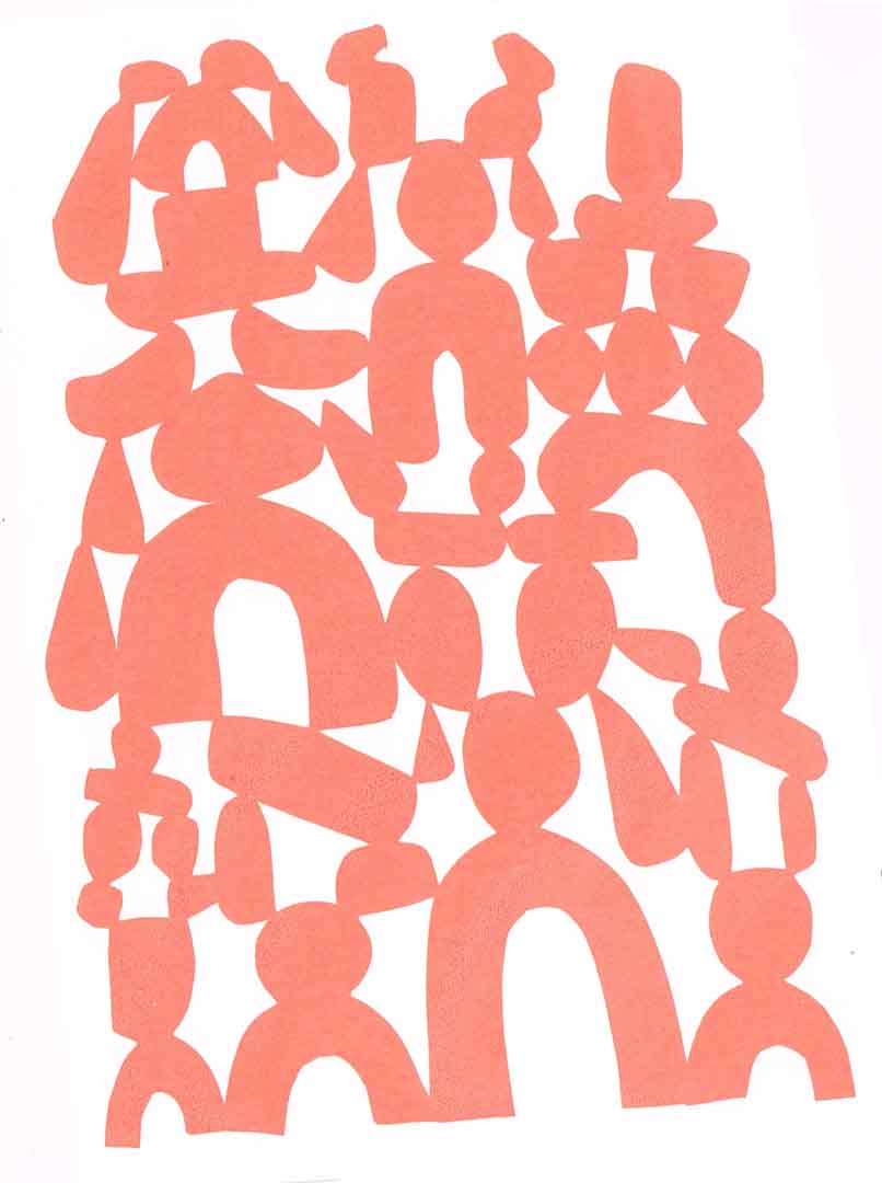


Working with this collection of designs I scanned in the initial proofed prints and started to play around with digital layering combinations to see what could happen and help visualise potential routes to take in the print studio.

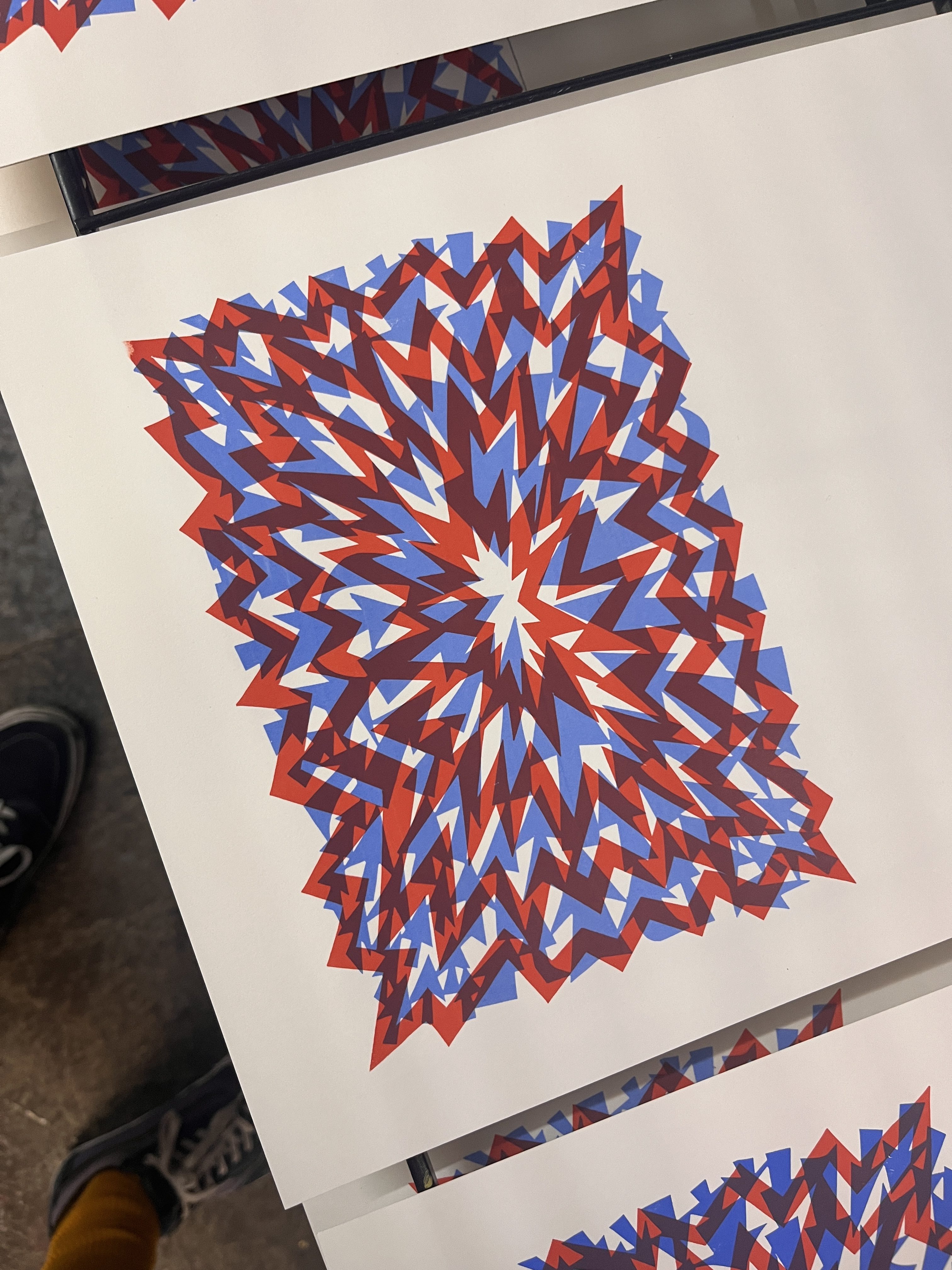
After this first lot of digital experiments I made a couple of screen print proofs to seeing what would happen. Below the image of explosions and arrows seemed a good combo, the idea of conflict and tension maybe too obvious in communicating the sense of the feelings I wanted to convey…

The sense of feeling overwhelmed by things that inspired the initial designs led me to create many designs, that the number of possibilities itself felt overwhelming, so I decided it was important to strip back my options. In finding the commonality within the original papercuts I decided only the ones made of the basic forms of circles, rectangles and triangles were the strongest.


I came back to the computer and played with more digital layering combinations, playing with colour schemes and layout ideas. I’ve always enjoyed using colour in my work but this project lead me to try and do more research to gain a greater understanding of colour theory and experiment with different pigments.
I’ve been interested in systematic methods of helping generate variables for visualisation and proofing combinations. Thinking about how many possible configurations there could be within a two colour print, using a number of options from the 4 selected papercuts I looked into some of the basic maths around factorials and calculating combinations.

By creating a digital contact sheet of all the possible configurations, I then thought about how this could be automated for other possible colour combinations. At the time of writing this I tend to avoid using AI for most things, as I do worry about the negative ecological effects currently, but I thought for programming language and code, the energy usage would be comparatively small and hoped it would be an efficient fix. Unfortunately I had no luck in getting the AI model to code a functional Photoshop Script, but someone from MIT had in fact created this. It allowed me to generate a contact sheet showing all possible colour combinations within a set range of chosen colours.

From this route of investigation it fascinated me the rate of growth from added variables, somewhat illustrating the expansive possibilities but overwhelming amount of options that once is faced with in decision making.
In my work I love the analog and using my hands but I find the visual experimentation of colour, overlaying and layout that Photoshop and other programmes offer can help spark and assist in creative exploration. Having found some layering and formats that I thought intriguing I worked to figure out how to create some of these effects in a completely analog production process, and to see how colours interact through pigments rather than through the light of a screen.


As a printmaker It’s easy to end up with a ton of prints left over that end up taking up a lot of space, so I decided the best approach to my investigations was to create just a few prints and put together two folios. These could then be used as starting points for more prints in future. Above you can see some if the prints I selected for the folio created using the various papercuts, some in the conventional way as exposed on screen, some used as paper stencils masking out layers below. I ended up with quite a few variations, some not so successful and others not managing to create two the same to warrant inclusion in the folios.


The edition entitled “How to Get There”, was created by using some of the original papercut designs, plus some cut specifically for the print. By doing some double exposing on screen I could get overlays similar to the digital experiments.
As well as having a meaning about the exploration and journey involved in creating a print, being only complete when it feels and looks right, the title is also in reference to common website sections that talk of travel accessibility. As I don’t currently drive I always use public transport and finding routes is common. The colour palettes and some elements of form in the print are based off the southern rail trains and Brighton busses I use most.

Playing further with this wide thin format I cut the lino block for a piece I titled “The Fog of War”, the forms reminding me of opposing views, the triangles of the left forms almost like megaphones shouting at the forms on the right unwilling to listen. The political climate and the flow of information/ misinformation something I find both fascinating and terrifying


Using one of the presses that didn’t have padding the pressure caused a very strong emboss. For the blue I screened the layer using a quick paper stencil. I would advise using dryers in the ink when combining acrylic screen ink and Cranfield water soluble relief inks, as the drying time was weeks! I didn’t end up with an edition I was pleased with, but the texture of the emboss gave me pause for thought.

I was really a fan of the green and pink colour combination, the particular process magenta from Golden has a great transparency creating a dense third colour in the overlap. So in next stage of the projects I decided to revisit this colour scheme.


When I decided on the limited forms from the selection of papercuts that started off the project, the influence on my drawing process increased. The escapism and relief in abstraction and ability to remove concern about what and how to draw, allowed me to have fun and explore. I decided to create a little artist booklet of a selection of these drawings with some accompanying text, hoping to give a bit more insight and reflection to the feelings imbued in the project.

Created by screen printing a 4-up layout the zine was made using one sheet of paper, a fun technical challenge to line up the front and back of the sheet of paper. Each has been stitch bound. A big thanks to my friend Josh who 3D printed me an Awl guide, which worked a treat. I made a small handful of copies and am excited to have them in the Derby Print Open that’s on throughout June 2026. Watch a little making of video below…
I also created a one off screen printed piece to accompany the booklet, adding some more texture by combining sanding, scratching and blotting.

Here’s a little snippet of the process in video form..